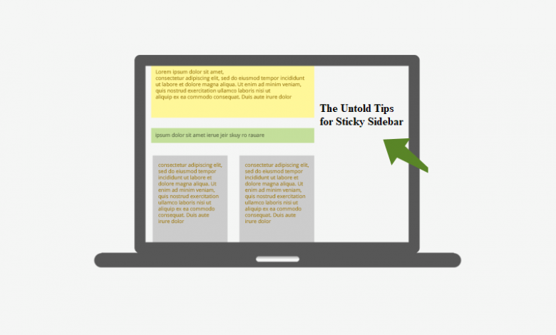
The Untold Tips for Sticky Sidebar

I’m sure many people have not noticed, but most of the websites we see today have a sticky sidebar. It remains fixed on one corner just like a noisy urchin in the class gets penalized by the teacher. Such sticky sidebars are often found in a business or corporate web design. The strategic positioning of a sticky sidebar is a perfect idea for fixing the CTA button.
Creating a sidebar is all about HTML coding. Most of the website creators have mastered different HTML codes for producing an effing amazing sticky sidebar. Everything revolves around coding. If the code is right, you’ll get the apt outcome and if it isn’t, forget the results. Let’s understand everything practically, by checking out some codes for making the perfect sticky sidebar for a corporate web design.
3 Features of Side Sticky Bar
The following are the features of a sticky sidebar:
- Top Positioning
For a clearer and uniform sticky bar, the designer can leave some space between the sticky element & the top of the page.
- Screen Size Compatibility
Definitely a point worth your attention! It is suggested to keep the corporate web design dynamic so that it is compatible with different screen sizes. Easy compatibility will prevent it from getting distorted when viewed on smaller screens.
- Push-up Element
It is an optional part. A developer can add a push-up element that works as a trampoline for the sticky sidebar. Integrating this feature will automatically push the sidebar on the top soon after reaching the page footer.
Tips For Crafting a Perfect Sticky Sidebar
By following guidelines, we kept ourselves safe to a great extent during the pandemic outbreak. Similarly, there are certain guidelines that must be followed while creating a sticky sidebar. These definitely help in avoiding the obstacles. Dive in.
- Setup Page Sections
Let’s begin with the FLEX display element. The best thing to understand and get apt results is by looking at the code.
.sidebar {
–offset: var(–space);
/* … */
position: sticky;
top: var(–offset);
}
This code expands the room for the sidebar. Regardless of the length of the sidebar, or better say its height, there will remain some space that stops it from touching the roof of the bar movement section.
- Real Sticky Sidebar
No component is sticky; it is the sidebar element that’s sticky. Its general layout must have the right anatomy explained in the code below:
.component {
display: grid;
grid-template-rows: auto 1fr auto;
}
.component .content {
max-height: 500px;
overflow-y: auto;
}
- It is a CSS grid component that configures the rows in the template. Everything is adjusted automatically
- Overflow:Y allows smooth scrolling of the content
- Max-height prevents excessive stretch from the outburst
NOTE: when max-height is integrated into the code, it eliminates the chances for the component’s height to exceed the pre-set limitation. It is done by adding the following syntax:
.sidebar .component {
max-height: calc(100vh – var(–offset) * 2);
}
Mic Drop
Positioning the ‘sticky’ is a not-so-major challenge. As a developer, an individual must possess the right understanding of the code. By cajoling with the header-footer theory of coding, conceiving the suitable sticky sidebar becomes a cakewalk. Deciding the height, width, and length becomes easier and it can be strategically placed so that it remains in the sight of visitors flocking to the website. Another point that should be considered is the screen configuration. All developers must be considerate of designing the suitable sticky. Screen resolution plays a key role and hence, you must craft a rightly designed sidebar that doesn’t get distorted in the slightest fraction.


